Document production
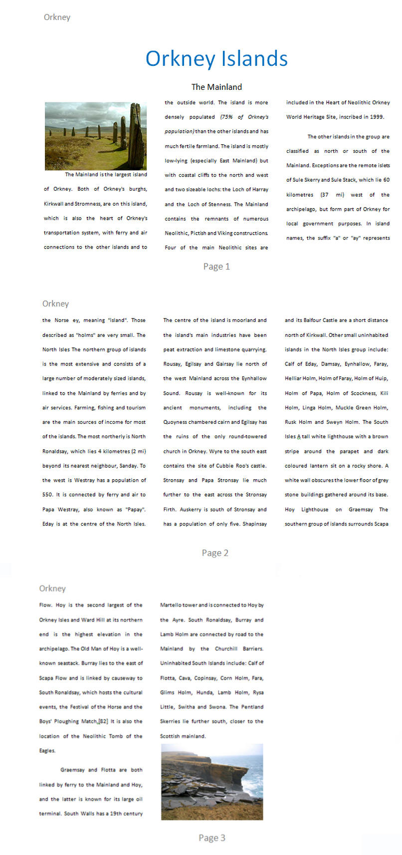
Look at the above document. As yourself: is it attractive and easy to read? Why? Why not?
The original text is very ugly! Click here to see the original text.
We will look at some common ways to format documents to make them attractive and readable.
Some common techniques are to include:
- a readable font eg Arial
- an appropriate font size
- a meaningful title
- line spacing
- columns
- automated page numbers
Document Specification
If you are going to create many documents, you will achieve a professional look if the formatting of the documents is consistent.
Many businesses follow a document specification.
Here is an example:
| Formatting item | Specification |
|---|---|
| orientation | portrait |
| line spacing | double |
| title | Calibri, font size 48, blue, center alignment |
| subtitle | Calibri, font size 18, black, center alignment |
| body text | Calibri, font size 12, justified alignment, 3 columns |
| image #1 | same width as column, before the first paragraph |
| image #2 | same width as column, afer the last paragraph |
| header | "Orkney", left alignment |
| footer | "Page" + automated page number, centre alignment |
Task
Follow the specification, format a document
Using the ugly text above and the document specification, can you format the ugly text to look the same as the document image at the top of this page.
You will have to research your own images. Make sure yours look similar to the images in the document above.
Help!
Extension I
Insert a screenshot of the Orkney Islands from Google Maps at the end of the document. It should not be in any columns.
Extension II
Beneath the screenshot, do some research and create a list of up to 5 bullet points explaining why tourists should visit Orkney.
- Reason 1
- Reason 2
- Reason 3
- Reason 4
- Reason 5
Extension III
Finally, find one instance of the word Orkney and create a hyperlink to a website about Orkney.
Tags
bit line spacing columns justified alignment automated portrait orientationheader footeralignment