PHOTOSHOP WORKS
Tutorial Work: Movie Poster
My Photoshop "career" kicked off with some tutorial videos made by Mr. Watson. He introduced me to many fundamental tools and skills of Photoshop, including Blend Modes, Adjustment Tools, Clipping Masks, and Layer Masks. Later on, I added my own twist to the tutorial work by adding the solar eclipse, some lines of teasers, a funny "hardcore" rating, and other essential elements of a movie poster.
Tutorial Links: Adjustment Layers | Brush Tool | Blend Modes
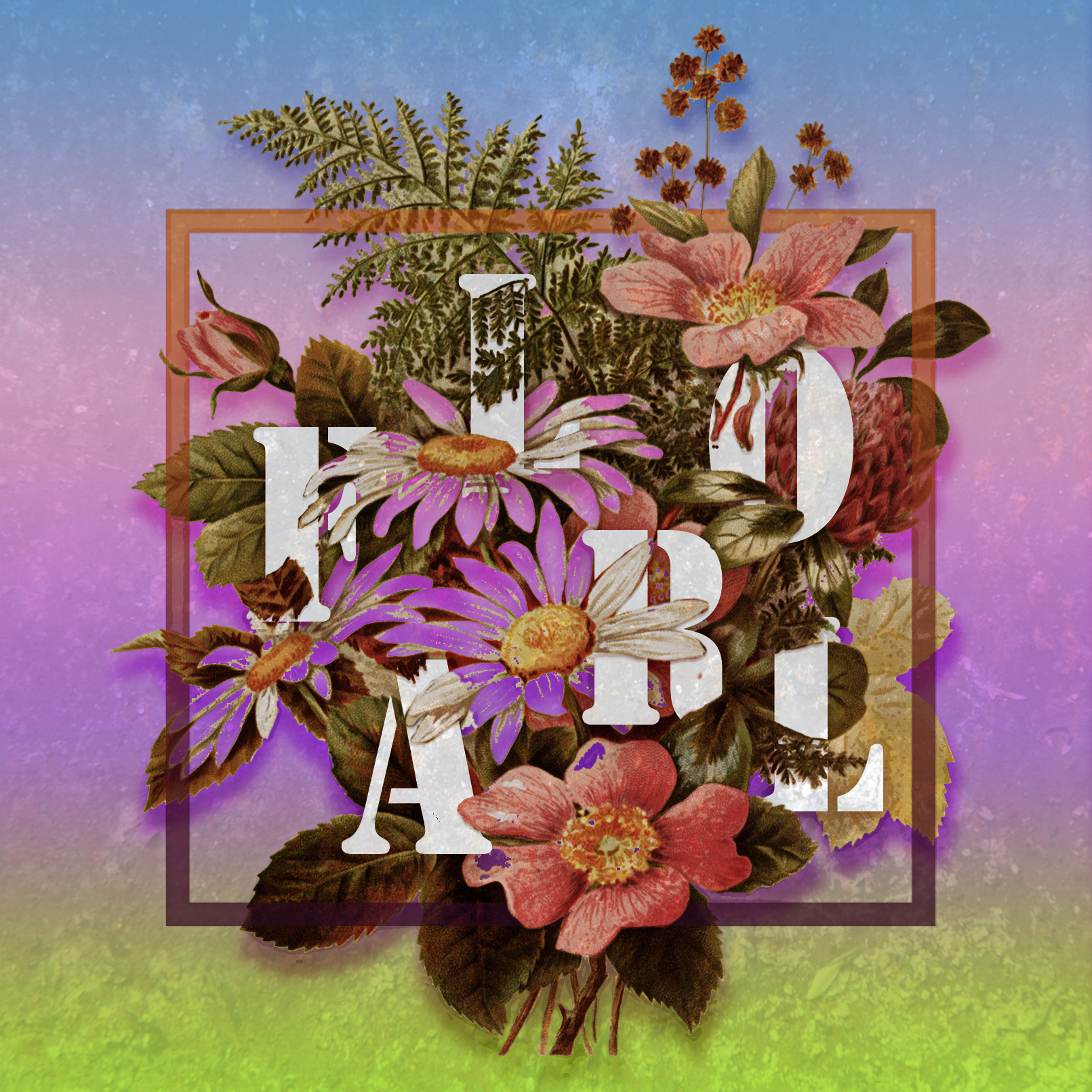
Tutorial Work: Floral Typography
This second tutorial work was challengingly captivating for a beginner. It was a great test to my patience as I had to spend hours to meticulously erase certain parts of the letters to blend it inside the flower. After that, I messed around with the tools I had learned earlier, the color gradients, and some filter effects. To me, this is the most aesthetic work I have ever done in Photoshop!
Tutorial Links: Floral Typography
Tutorial Work: Double Exposure
As I went through some YouTube tutorial suggestions, the Double Exposure idea strongly fascinated me. It elevated my Blend Modes and Layer Masks skills to a higher level. My inspiration came from one of my friends who was dealing with social struggles and desperately crying to free herself from pessimistic thoughts.
Tutorial Links: Double Exposure
Tutorial Work: We Don't Talk Anymore
At the first glance of the "Transparent Clothes" tutorial video, a visual of a heartbroken man seeing his ex-lover walking away from him ran through my mind. With the accompany of another tutorial on the Glitch Text Effect and my own creativity in blending the lightning and raindrops into the image as well as messing around with the color, I had made my idea into a reality! The line "We Don't Talk Anymore" was also an allusion to the hottest Vietnamese social media meme at that time, when Charlie Puth's same-titled hit was compared to Vietnamese popstar Son Tung MTP's new single "We Don't Belong to Each Other".
Tutorial Links: Transparent Clothes | Glitch Text
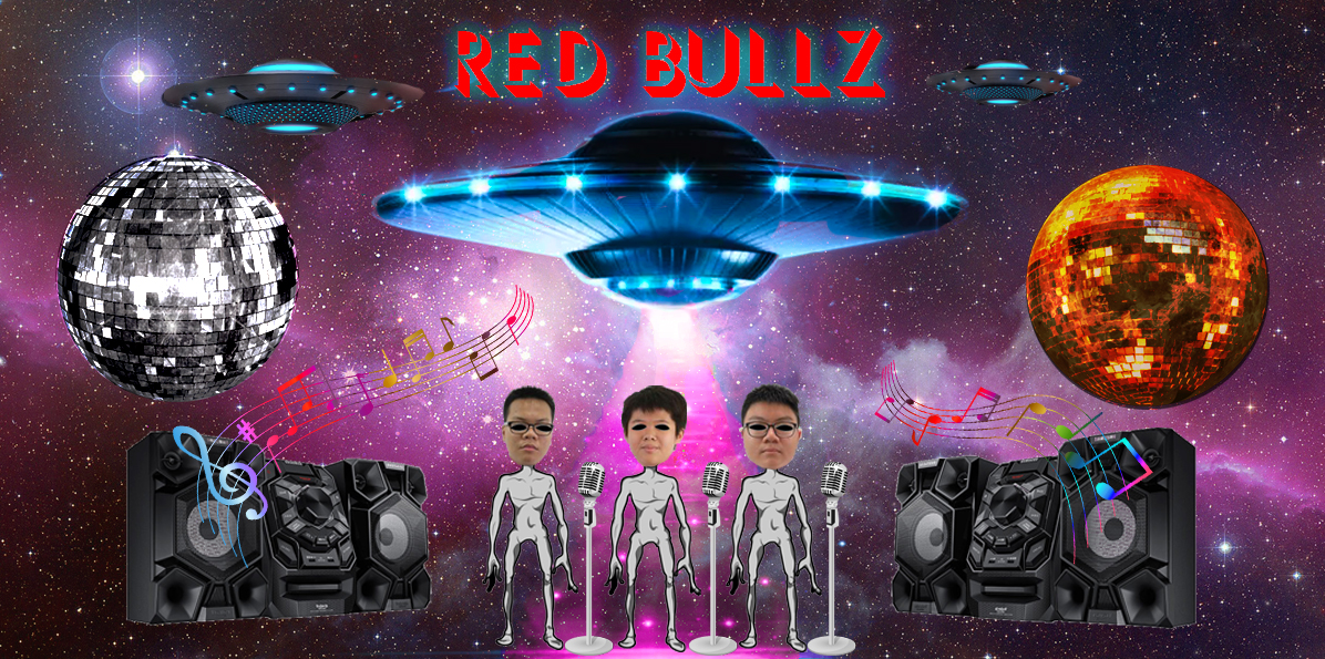
Red Bullz Poster
The most not-so-serious work of the year! This peculiar poster with annoying alien graphics and inharmonious color choices was made for my group presentation in Geography class when we had to sing a parody song about planet Mercury. That was a bizarrely fun opportunity to put my Photoshop skills in a real-life situation for the first time ever!
SCHOOL POSTER PROJECTS
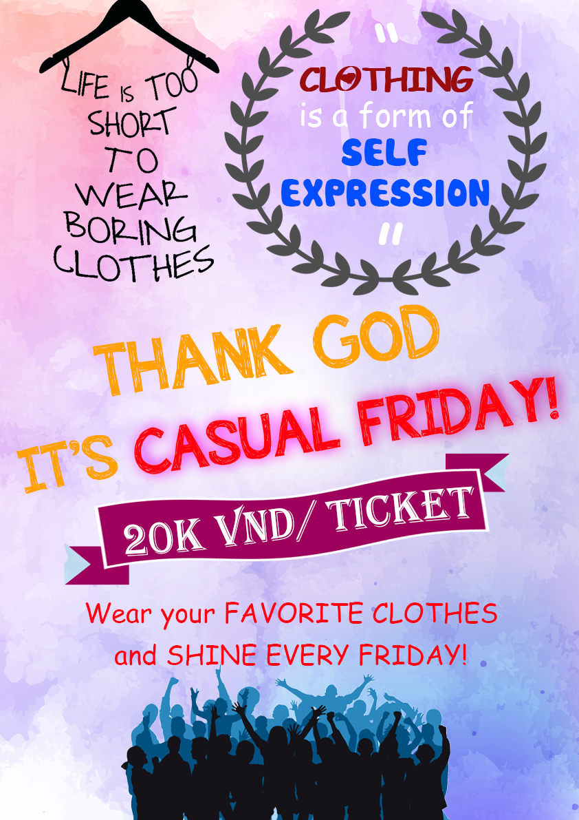
As a member in ISHCMC-AA Student Council Media Department in semester 1, I designed some posters to promote school events. Those were amazing opportunities to contribute what I just had learned in the course for my school community!
MUSIC ALBUM COVERS DESIGN